Brand identity
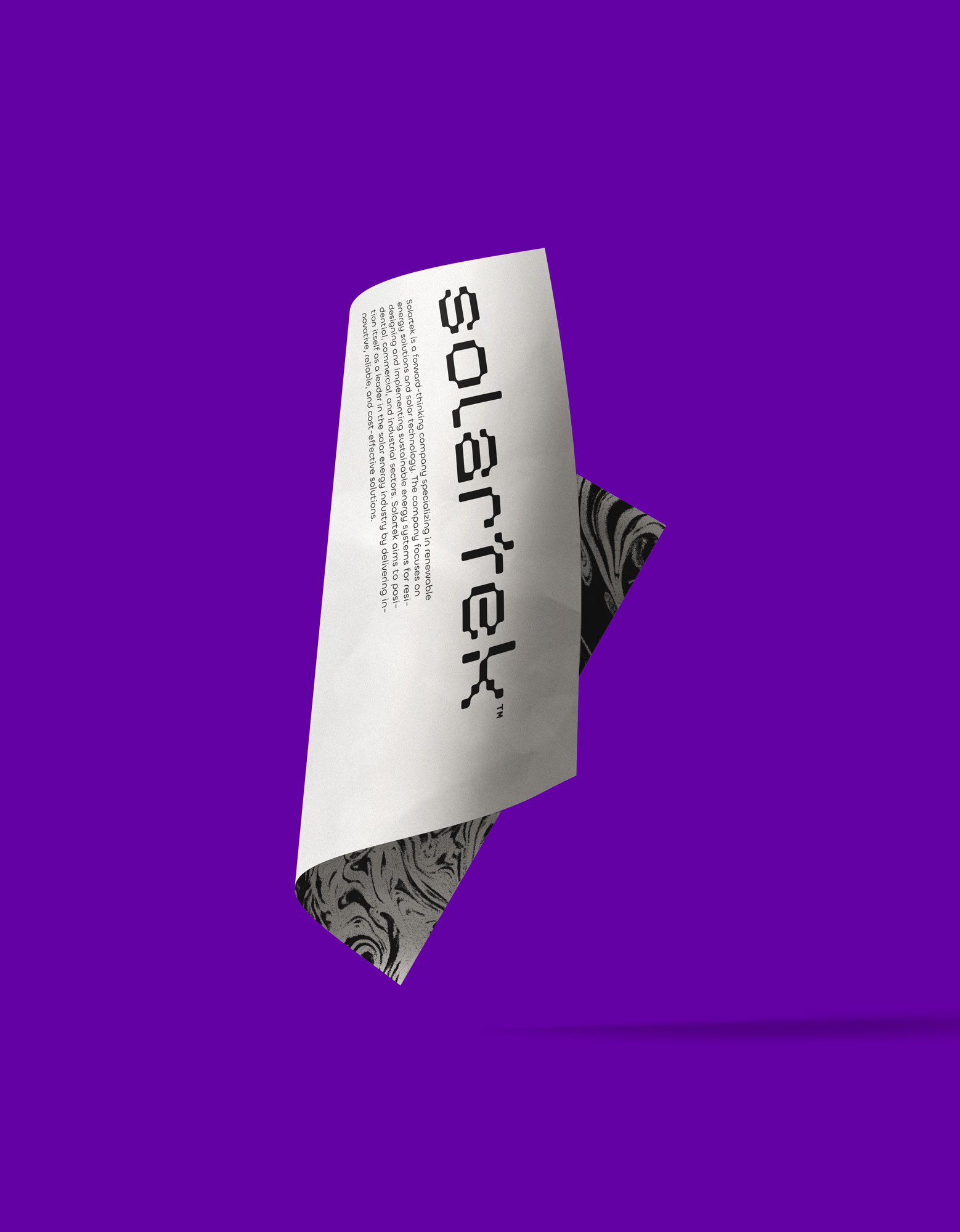
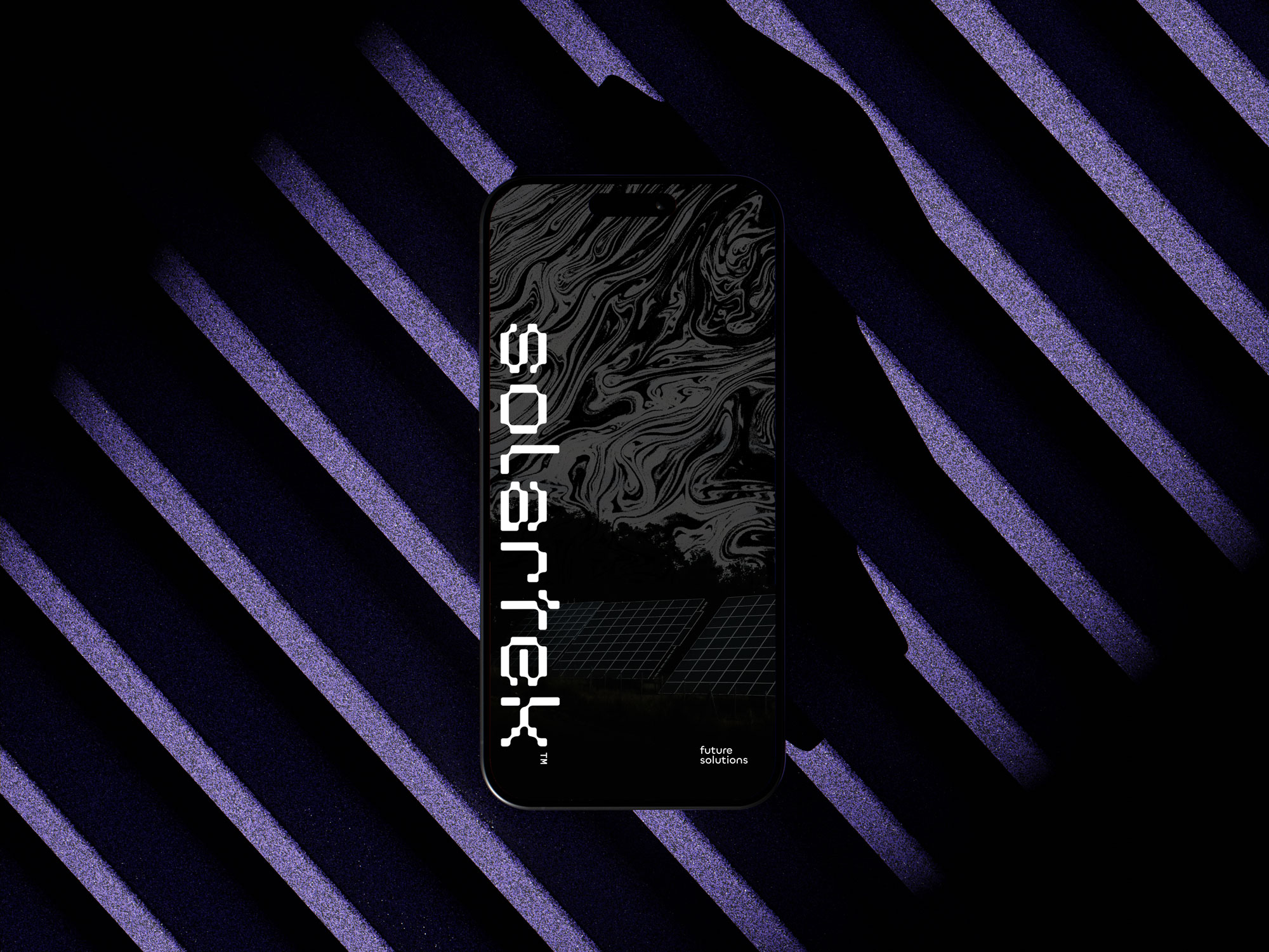
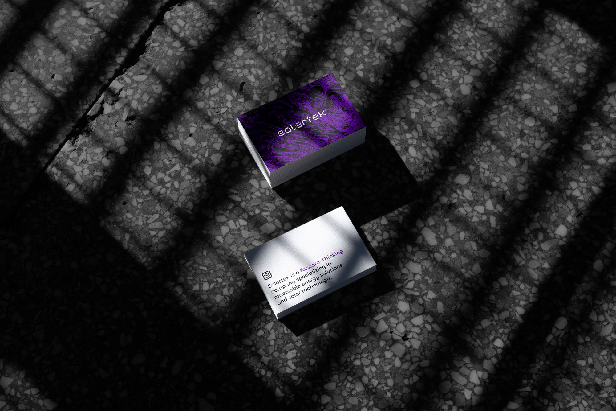
Solartek
A forward-thinking company specializing in renewable energy solutions and solar technology.
The primary goal was to create a cohesive and modern visual identity that would accurately represent Solartek’s values and expertise. The new brand identity needed to evoke a sense of innovation, trustworthiness, and sustainability while appealing to both residential and commercial customers, as well as industry professionals.
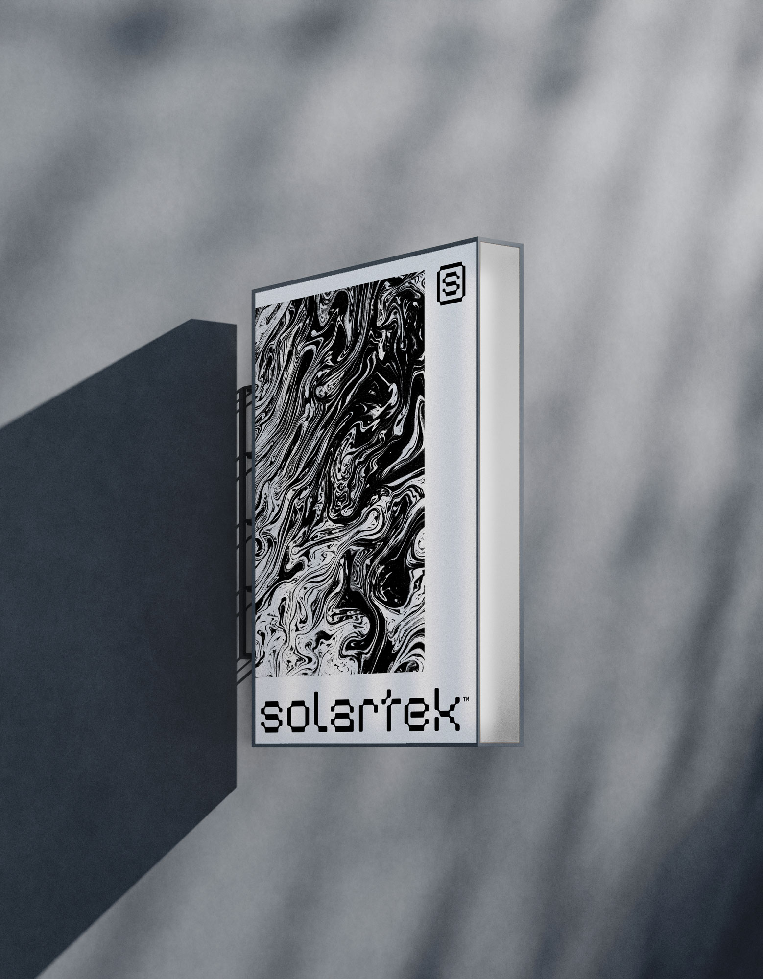
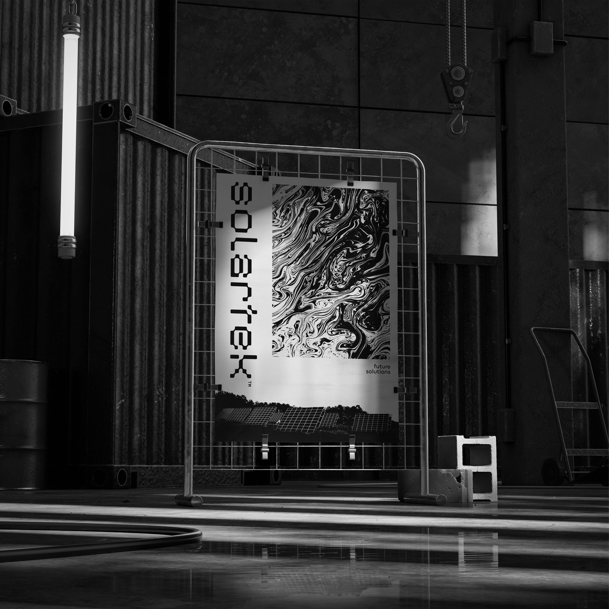
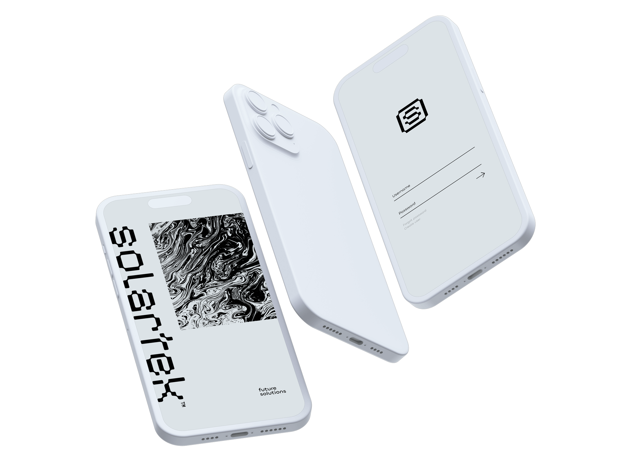
The Solartek logo is a fusion of cutting-edge technology, boundless innovation, and the limitless potential of a sustainable future. The custom font used for the wordmark is crafted with precision and purpose, and each element of the logo is designed to resonate with the core values of the brand.


#6300a3
#161616
#f3fbff
The typography is complementing the logo wordmark, because of the balance between modernity and technological advancement. The Chillax font aligns seamlessly with the modern aesthetics of the logo wordmark, reinforcing the idea that Solartek is at the forefront of innovation in the industry.
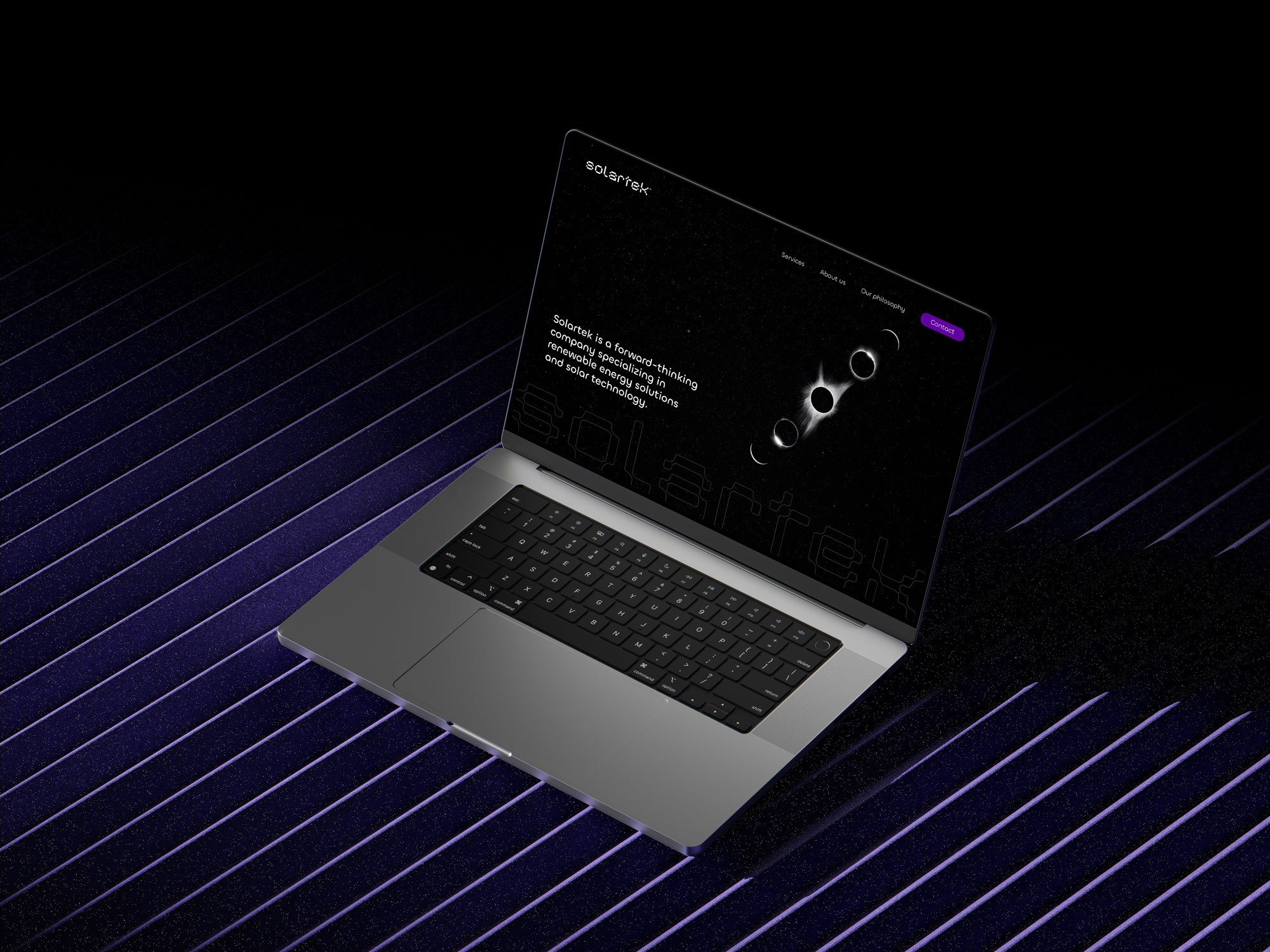
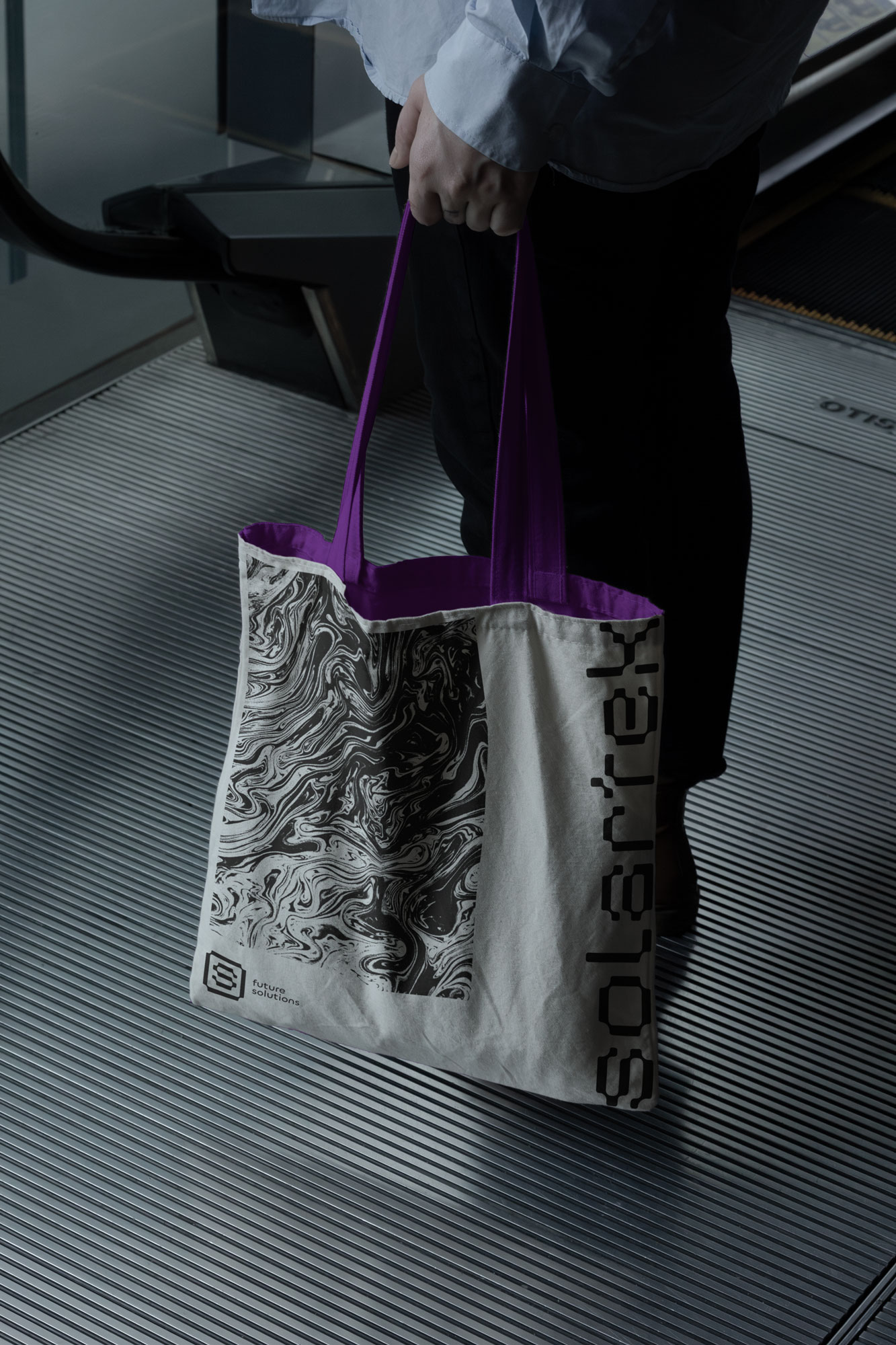
The simple color palette features a vibrant and deep shade of purple as the primary color. The purple evokes a sense of strength and sophistication, capturing attention and leaving a lasting impression. It signifies Solartek’s powerful presence in the renewable energy sector and its determination to illuminate a brighter, more sustainable future.
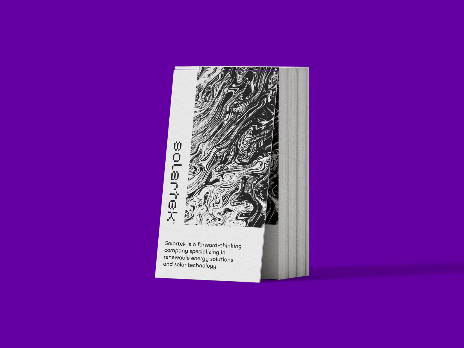
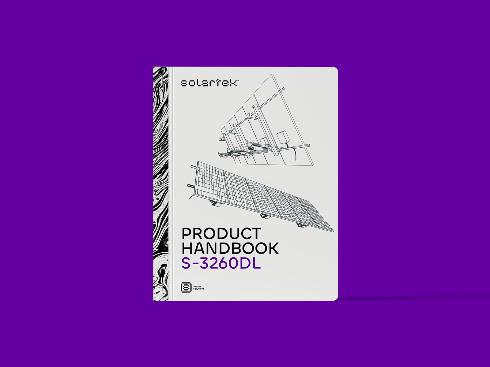
The graphic element visualizes an energy burst and captures a sense of movement and boundless power. The dynamic pattern enhances the brand’s overall aesthetic and distinctiveness, setting Solartek apart from its competitors.